
Tomonaka is a local restaurant specializing in Japanese cuisine. The name Tomonaka comes from the words "tomodachi" and "nakama" . The brand pushes the idea of enjoying food with company and being in a friendly environment.
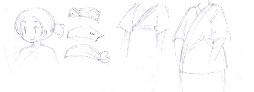
A cartoon chef mascot was designed to help cater the restaurant more to their target demographic of a younger audience. She draws in visitors with her culinary expertise, her energy, and charming nature. Photography also played a major role in showcasing the restaurant's best dishes.


Tomonaka uses red (the primary colour), a secondary analogous colour for aside content, and white/black for contrast. Red and white are significant colours as they are a part of Japan's flag, and red can be a colour of vitality, power, energy, and happiness.
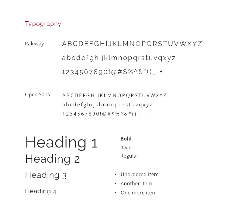
The main fonts of choice for Tomonaka are Raleway for distinguishable headings and Open Sans (Light) for body text. Navigation and footer links have extra letter spacing for readability. Icon fonts are also used to quickly and easily recognize navigation items. I chose mainly sans-serif types. Sans-serif fonts are simple and easier to read on desktop and mobile screens. I also chose a thin weight in some areas because it is not only a modern trend, but it helps to reduce clutter and add simplicity to modern pages that are often packed with content on small screens.

Coded without the use of frameworks.

If you have an amazing project idea that you think I can help with, I'd love to hear about it. Please contact me.